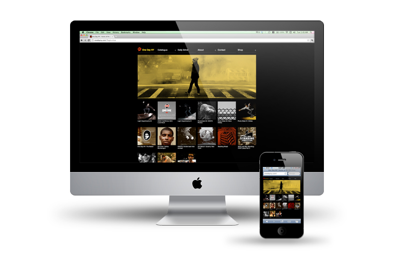
Just as the title suggests. New year, new look. We’re trying to get things lined up for the very anticipated warm weather. The choice was made to go with a standard scrolling website due to many complications in the old websites function. Although we sacrificed the horizontal scrolling, we implemented a portfolio style layout to help display our work as a collective.
As for things to coming up very soon, we have a few interviews lined up with select figures in the NYC scene as well as a dope little edit contest that’s in collaboration with I Roll NY. I’ll be announcing that later today.
I also have to say that I’m glad that the site is now iphone4 friendly so you should be able to access the site directly at onedayny.com as frequent and hassle free as possible.


